The LYRA identity
Grounded in structure.
Free to flow.
A shared language for expressing LYRA with clarity and care. Explore our visual identity and the principles that bring it to life.
Download brand guidelinesPDF · 26 pages · Version 1.1
Structural Integrity. Systemic Flow.
Colour & character
Warmth, with a grounded centre.
Cream leads, charcoal anchors and bronze adds emphasis. Place the bronze logo on cream, ivory or near-white surfaces only, never on brown or dark backgrounds.
Cream
#F8F5F0
Our signature canvas
Charcoal
#33251E
Headings and grounding
Bronze
#AB6646
Selective emphasis
Deep bronze
#713E26
Links and controls
Sand
#F1EAE0
Quiet supporting surfaces
Cormorant Garamond
An editorial voice.
Room for expression.
Expressive headings, with selective italic emphasis.
Source Sans 3
Clear thinking.
Thoughtful communication.
A precise, understated companion for body text and navigation.
The brand in practice
Considered at every touchpoint.
Tactile materials, generous space and a consistent signature, from the first introduction to the work that follows.
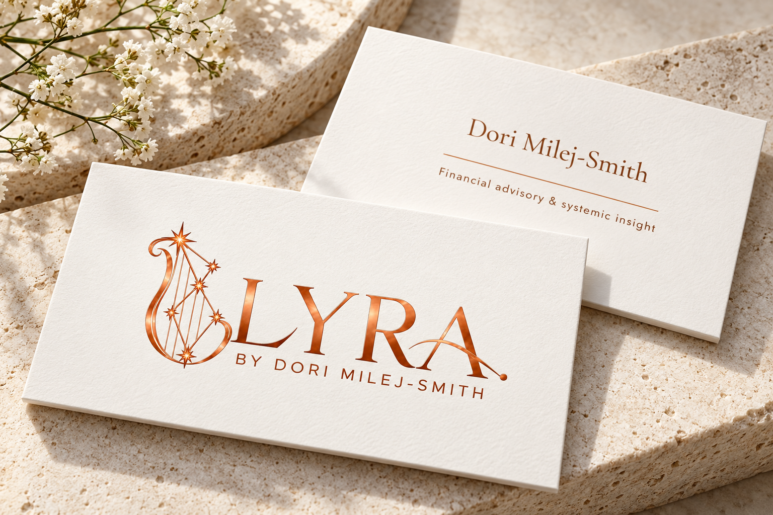
Business cards
A considered first impression.
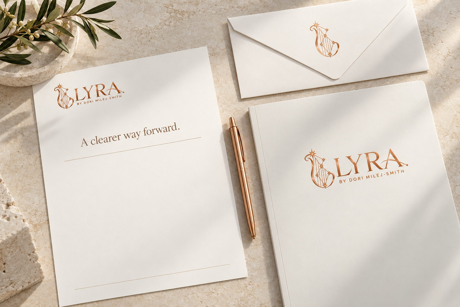
Stationery
Consistency in every detail.
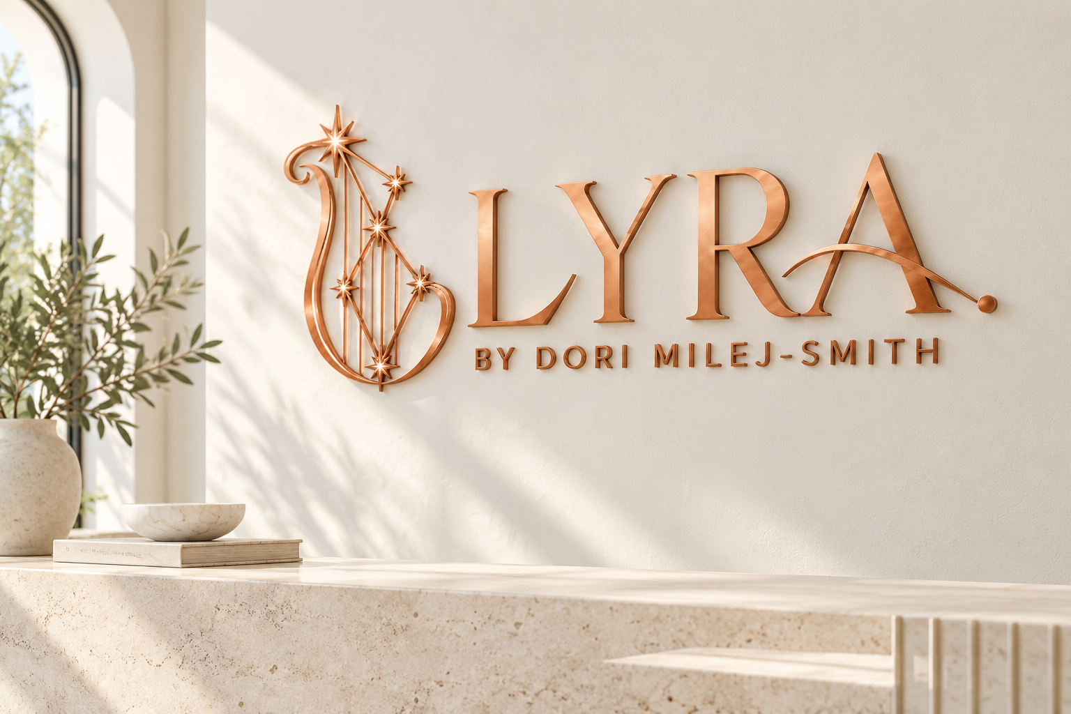
Reception signage
An identity with presence.
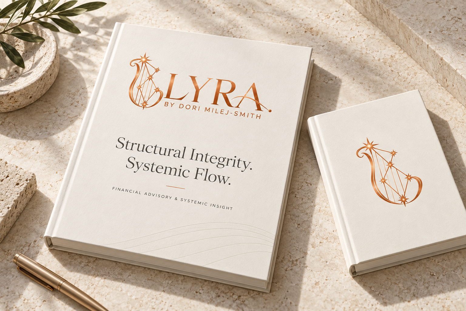
Reports & notebooks
Structure, held in the hand.
These generated mockups illustrate the creative direction. Use the original logo artwork for production and proof all lettering, materials and finishes.
One identity. A shared standard.
The complete guide covers logo variations, clear space, colour specifications, typography, imagery, motion and correct use.
View the complete guide (PDF, opens in a new tab) →